 Add to Chrome
 Add to Firefox
 Add to Edge
InfoChartQA: A Benchmark for Multimodal Question Answering on Infographic Charts
May 25, 2025Understanding infographic charts with design-driven visual elements (e.g., pictograms, icons) requires both visual recognition and reasoning, posing challenges for multimodal large language models (MLLMs). However, existing visual-question answering benchmarks fall short in evaluating these capabilities of MLLMs due to the lack of paired plain charts and visual-element-based questions. To bridge this gap, we introduce InfoChartQA, a benchmark for evaluating MLLMs on infographic chart understanding. It includes 5,642 pairs of infographic and plain charts, each sharing the same underlying data but differing in visual presentations. We further design visual-element-based questions to capture their unique visual designs and communicative intent. Evaluation of 20 MLLMs reveals a substantial performance decline on infographic charts, particularly for visual-element-based questions related to metaphors. The paired infographic and plain charts enable fine-grained error analysis and ablation studies, which highlight new opportunities for advancing MLLMs in infographic chart understanding. We release InfoChartQA at https://github.com/CoolDawnAnt/InfoChartQA.
ChartGalaxy: A Dataset for Infographic Chart Understanding and Generation
May 24, 2025Infographic charts are a powerful medium for communicating abstract data by combining visual elements (e.g., charts, images) with textual information. However, their visual and structural richness poses challenges for large vision-language models (LVLMs), which are typically trained on plain charts. To bridge this gap, we introduce ChartGalaxy, a million-scale dataset designed to advance the understanding and generation of infographic charts. The dataset is constructed through an inductive process that identifies 75 chart types, 330 chart variations, and 68 layout templates from real infographic charts and uses them to create synthetic ones programmatically. We showcase the utility of this dataset through: 1) improving infographic chart understanding via fine-tuning, 2) benchmarking code generation for infographic charts, and 3) enabling example-based infographic chart generation. By capturing the visual and structural complexity of real design, ChartGalaxy provides a useful resource for enhancing multimodal reasoning and generation in LVLMs.
OrionBench: A Benchmark for Chart and Human-Recognizable Object Detection in Infographics
May 23, 2025


Given the central role of charts in scientific, business, and communication contexts, enhancing the chart understanding capabilities of vision-language models (VLMs) has become increasingly critical. A key limitation of existing VLMs lies in their inaccurate visual grounding of infographic elements, including charts and human-recognizable objects (HROs) such as icons and images. However, chart understanding often requires identifying relevant elements and reasoning over them. To address this limitation, we introduce OrionBench, a benchmark designed to support the development of accurate object detection models for charts and HROs in infographics. It contains 26,250 real and 78,750 synthetic infographics, with over 6.9 million bounding box annotations. These annotations are created by combining the model-in-the-loop and programmatic methods. We demonstrate the usefulness of OrionBench through three applications: 1) constructing a Thinking-with-Boxes scheme to boost the chart understanding performance of VLMs, 2) comparing existing object detection models, and 3) applying the developed detection model to document layout and UI element detection.
Structural-Entropy-Based Sample Selection for Efficient and Effective Learning
Oct 03, 2024


Sample selection improves the efficiency and effectiveness of machine learning models by providing informative and representative samples. Typically, samples can be modeled as a sample graph, where nodes are samples and edges represent their similarities. Most existing methods are based on local information, such as the training difficulty of samples, thereby overlooking global information, such as connectivity patterns. This oversight can result in suboptimal selection because global information is crucial for ensuring that the selected samples well represent the structural properties of the graph. To address this issue, we employ structural entropy to quantify global information and losslessly decompose it from the whole graph to individual nodes using the Shapley value. Based on the decomposition, we present $\textbf{S}$tructural-$\textbf{E}$ntropy-based sample $\textbf{S}$election ($\textbf{SES}$), a method that integrates both global and local information to select informative and representative samples. SES begins by constructing a $k$NN-graph among samples based on their similarities. It then measures sample importance by combining structural entropy (global metric) with training difficulty (local metric). Finally, SES applies importance-biased blue noise sampling to select a set of diverse and representative samples. Comprehensive experiments on three learning scenarios -- supervised learning, active learning, and continual learning -- clearly demonstrate the effectiveness of our method.
A Scalable Matrix Visualization for Understanding Tree Ensemble Classifiers
Sep 05, 2024


The high performance of tree ensemble classifiers benefits from a large set of rules, which, in turn, makes the models hard to understand. To improve interpretability, existing methods extract a subset of rules for approximation using model reduction techniques. However, by focusing on the reduced rule set, these methods often lose fidelity and ignore anomalous rules that, despite their infrequency, play crucial roles in real-world applications. This paper introduces a scalable visual analysis method to explain tree ensemble classifiers that contain tens of thousands of rules. The key idea is to address the issue of losing fidelity by adaptively organizing the rules as a hierarchy rather than reducing them. To ensure the inclusion of anomalous rules, we develop an anomaly-biased model reduction method to prioritize these rules at each hierarchical level. Synergized with this hierarchical organization of rules, we develop a matrix-based hierarchical visualization to support exploration at different levels of detail. Our quantitative experiments and case studies demonstrate how our method fosters a deeper understanding of both common and anomalous rules, thereby enhancing interpretability without sacrificing comprehensiveness.
Foundation Models Meet Visualizations: Challenges and Opportunities
Oct 09, 2023


Recent studies have indicated that foundation models, such as BERT and GPT, excel in adapting to a variety of downstream tasks. This adaptability has established them as the dominant force in building artificial intelligence (AI) systems. As visualization techniques intersect with these models, a new research paradigm emerges. This paper divides these intersections into two main areas: visualizations for foundation models (VIS4FM) and foundation models for visualizations (FM4VIS). In VIS4FM, we explore the primary role of visualizations in understanding, refining, and evaluating these intricate models. This addresses the pressing need for transparency, explainability, fairness, and robustness. Conversely, within FM4VIS, we highlight how foundation models can be utilized to advance the visualization field itself. The confluence of foundation models and visualizations holds great promise, but it also comes with its own set of challenges. By highlighting these challenges and the growing opportunities, this paper seeks to provide a starting point for continued exploration in this promising avenue.
A Unified Interactive Model Evaluation for Classification, Object Detection, and Instance Segmentation in Computer Vision
Aug 09, 2023


Existing model evaluation tools mainly focus on evaluating classification models, leaving a gap in evaluating more complex models, such as object detection. In this paper, we develop an open-source visual analysis tool, Uni-Evaluator, to support a unified model evaluation for classification, object detection, and instance segmentation in computer vision. The key idea behind our method is to formulate both discrete and continuous predictions in different tasks as unified probability distributions. Based on these distributions, we develop 1) a matrix-based visualization to provide an overview of model performance; 2) a table visualization to identify the problematic data subsets where the model performs poorly; 3) a grid visualization to display the samples of interest. These visualizations work together to facilitate the model evaluation from a global overview to individual samples. Two case studies demonstrate the effectiveness of Uni-Evaluator in evaluating model performance and making informed improvements.
TimePool: Visually Answer "Which and When" Questions On Univariate Time Series
Aug 01, 2023When exploring time series datasets, analysts often pose "which and when" questions. For example, with world life expectancy data over one hundred years, they may inquire about the top 10 countries in life expectancy and the time period when they achieved this status, or which countries have had longer life expectancy than Ireland and when. This paper proposes TimePool, a new visualization prototype, to address this need for univariate time series analysis. It allows users to construct interactive "which and when" queries and visually explore the results for insights.
Visual Analytics For Machine Learning: A Data Perspective Survey
Jul 15, 2023


The past decade has witnessed a plethora of works that leverage the power of visualization (VIS) to interpret machine learning (ML) models. The corresponding research topic, VIS4ML, keeps growing at a fast pace. To better organize the enormous works and shed light on the developing trend of VIS4ML, we provide a systematic review of these works through this survey. Since data quality greatly impacts the performance of ML models, our survey focuses specifically on summarizing VIS4ML works from the data perspective. First, we categorize the common data handled by ML models into five types, explain the unique features of each type, and highlight the corresponding ML models that are good at learning from them. Second, from the large number of VIS4ML works, we tease out six tasks that operate on these types of data (i.e., data-centric tasks) at different stages of the ML pipeline to understand, diagnose, and refine ML models. Lastly, by studying the distribution of 143 surveyed papers across the five data types, six data-centric tasks, and their intersections, we analyze the prospective research directions and envision future research trends.
Visual Analysis of Neural Architecture Spaces for Summarizing Design Principles
Aug 20, 2022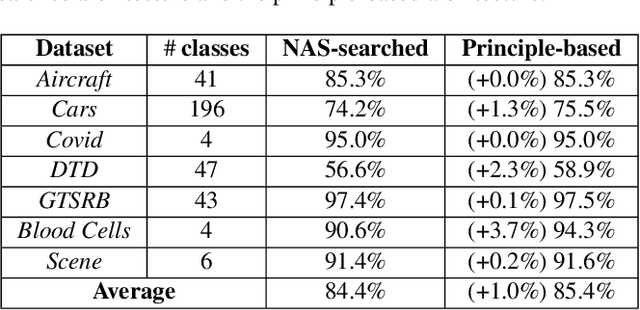
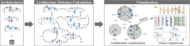
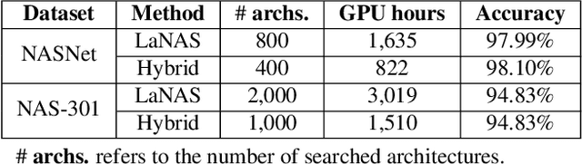
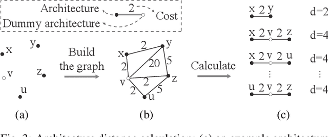
Recent advances in artificial intelligence largely benefit from better neural network architectures. These architectures are a product of a costly process of trial-and-error. To ease this process, we develop ArchExplorer, a visual analysis method for understanding a neural architecture space and summarizing design principles. The key idea behind our method is to make the architecture space explainable by exploiting structural distances between architectures. We formulate the pairwise distance calculation as solving an all-pairs shortest path problem. To improve efficiency, we decompose this problem into a set of single-source shortest path problems. The time complexity is reduced from O(kn^2N) to O(knN). Architectures are hierarchically clustered according to the distances between them. A circle-packing-based architecture visualization has been developed to convey both the global relationships between clusters and local neighborhoods of the architectures in each cluster. Two case studies and a post-analysis are presented to demonstrate the effectiveness of ArchExplorer in summarizing design principles and selecting better-performing architectures.