 Add to Chrome
 Add to Firefox
 Add to Edge
ShortcutLens: A Visual Analytics Approach for Exploring Shortcuts in Natural Language Understanding Dataset
Aug 17, 2022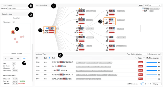
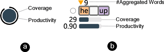
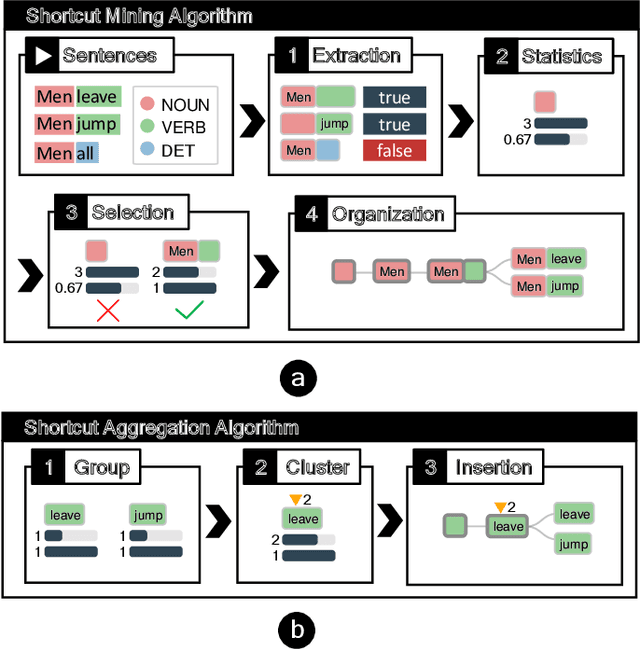
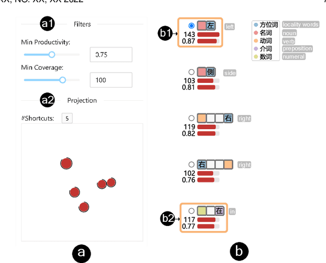
Benchmark datasets play an important role in evaluating Natural Language Understanding (NLU) models. However, shortcuts -- unwanted biases in the benchmark datasets -- can damage the effectiveness of benchmark datasets in revealing models' real capabilities. Since shortcuts vary in coverage, productivity, and semantic meaning, it is challenging for NLU experts to systematically understand and avoid them when creating benchmark datasets. In this paper, we develop a visual analytics system, ShortcutLens, to help NLU experts explore shortcuts in NLU benchmark datasets. The system allows users to conduct multi-level exploration of shortcuts. Specifically, Statistics View helps users grasp the statistics such as coverage and productivity of shortcuts in the benchmark dataset. Template View employs hierarchical and interpretable templates to summarize different types of shortcuts. Instance View allows users to check the corresponding instances covered by the shortcuts. We conduct case studies and expert interviews to evaluate the effectiveness and usability of the system. The results demonstrate that ShortcutLens supports users in gaining a better understanding of benchmark dataset issues through shortcuts, inspiring them to create challenging and pertinent benchmark datasets.
GestureLens: Visual Analysis of Gestures in Presentation Videos
Apr 23, 2022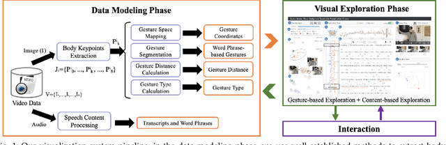
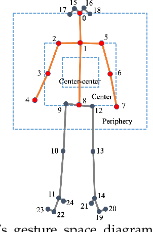
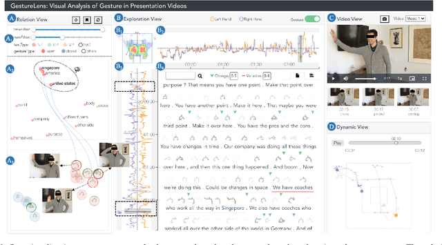
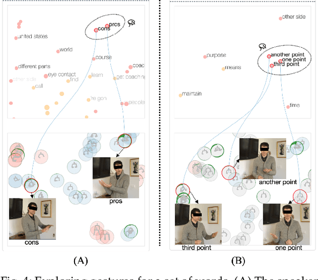
Appropriate gestures can enhance message delivery and audience engagement in both daily communication and public presentations. In this paper, we contribute a visual analytic approach that assists professional public speaking coaches in improving their practice of gesture training through analyzing presentation videos. Manually checking and exploring gesture usage in the presentation videos is often tedious and time-consuming. There lacks an efficient method to help users conduct gesture exploration, which is challenging due to the intrinsically temporal evolution of gestures and their complex correlation to speech content. In this paper, we propose GestureLens, a visual analytics system to facilitate gesture-based and content-based exploration of gesture usage in presentation videos. Specifically, the exploration view enables users to obtain a quick overview of the spatial and temporal distributions of gestures. The dynamic hand movements are firstly aggregated through a heatmap in the gesture space for uncovering spatial patterns, and then decomposed into two mutually perpendicular timelines for revealing temporal patterns. The relation view allows users to explicitly explore the correlation between speech content and gestures by enabling linked analysis and intuitive glyph designs. The video view and dynamic view show the context and overall dynamic movement of the selected gestures, respectively. Two usage scenarios and expert interviews with professional presentation coaches demonstrate the effectiveness and usefulness of GestureLens in facilitating gesture exploration and analysis of presentation videos.
Persua: A Visual Interactive System to Enhance the Persuasiveness of Arguments in Online Discussion
Apr 21, 2022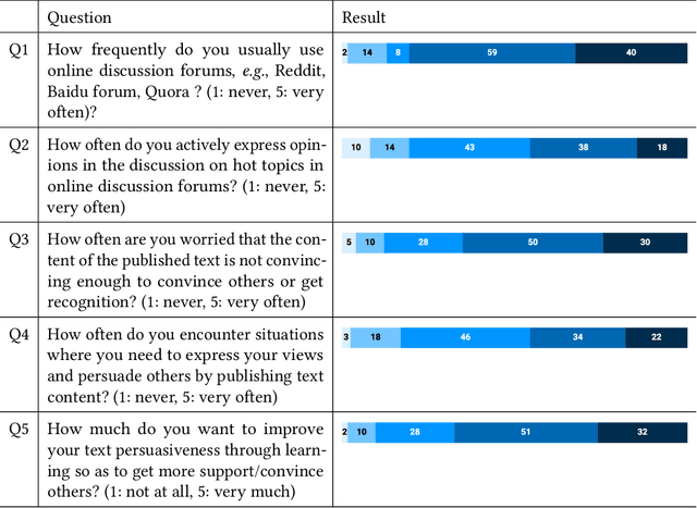
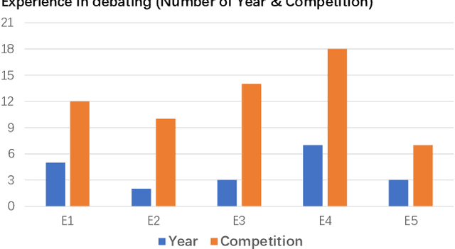
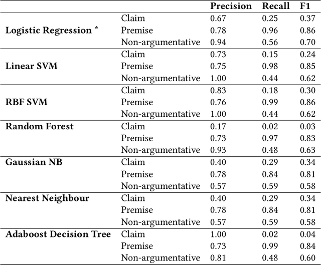
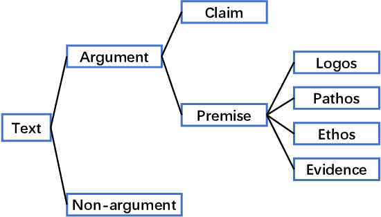
Persuading people to change their opinions is a common practice in online discussion forums on topics ranging from political campaigns to relationship consultation. Enhancing people's ability to write persuasive arguments could not only practice their critical thinking and reasoning but also contribute to the effectiveness and civility in online communication. It is, however, not an easy task in online discussion settings where written words are the primary communication channel. In this paper, we derived four design goals for a tool that helps users improve the persuasiveness of arguments in online discussions through a survey with 123 online forum users and interviews with five debating experts. To satisfy these design goals, we analyzed and built a labeled dataset of fine-grained persuasive strategies (i.e., logos, pathos, ethos, and evidence) in 164 arguments with high ratings on persuasiveness from ChangeMyView, a popular online discussion forum. We then designed an interactive visual system, Persua, which provides example-based guidance on persuasive strategies to enhance the persuasiveness of arguments. In particular, the system constructs portfolios of arguments based on different persuasive strategies applied to a given discussion topic. It then presents concrete examples based on the difference between the portfolios of user input and high-quality arguments in the dataset. A between-subjects study shows suggestive evidence that Persua encourages users to submit more times for feedback and helps users improve more on the persuasiveness of their arguments than a baseline system. Finally, a set of design considerations was summarized to guide future intelligent systems that improve the persuasiveness in text.
Interactive Data Analysis with Next-step Natural Language Query Recommendation
Jan 13, 2022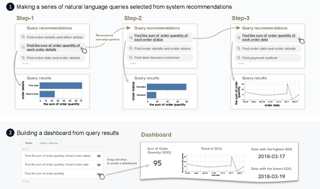
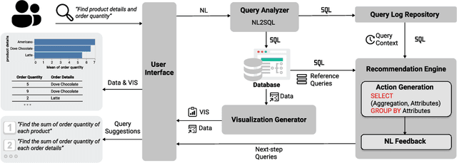

Natural language interfaces (NLIs) provide users with a convenient way to interactively analyze data through natural language queries. Nevertheless, interactive data analysis is a demanding process, especially for novice data analysts. When exploring large and complex datasets from different domains, data analysts do not necessarily have sufficient knowledge about data and application domains. It makes them unable to efficiently elicit a series of queries and extensively derive desirable data insights. In this paper, we develop an NLI with a step-wise query recommendation module to assist users in choosing appropriate next-step exploration actions. The system adopts a data-driven approach to generate step-wise semantically relevant and context-aware query suggestions for application domains of users' interest based on their query logs. Also, the system helps users organize query histories and results into a dashboard to communicate the discovered data insights. With a comparative user study, we show that our system can facilitate a more effective and systematic data analysis process than a baseline without the recommendation module.
NumGPT: Improving Numeracy Ability of Generative Pre-trained Models
Sep 07, 2021
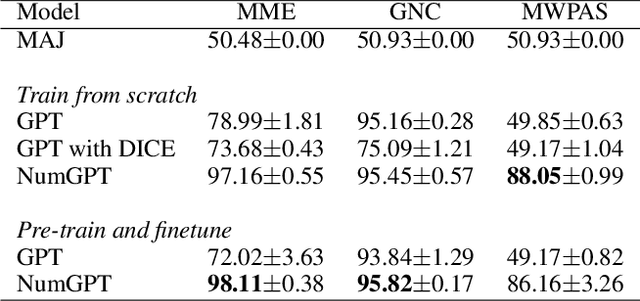
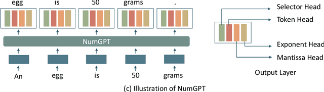
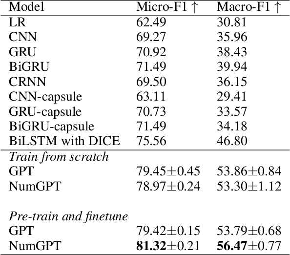
Existing generative pre-trained language models (e.g., GPT) focus on modeling the language structure and semantics of general texts. However, those models do not consider the numerical properties of numbers and cannot perform robustly on numerical reasoning tasks (e.g., math word problems and measurement estimation). In this paper, we propose NumGPT, a generative pre-trained model that explicitly models the numerical properties of numbers in texts. Specifically, it leverages a prototype-based numeral embedding to encode the mantissa of the number and an individual embedding to encode the exponent of the number. A numeral-aware loss function is designed to integrate numerals into the pre-training objective of NumGPT. We conduct extensive experiments on four different datasets to evaluate the numeracy ability of NumGPT. The experiment results show that NumGPT outperforms baseline models (e.g., GPT and GPT with DICE) on a range of numerical reasoning tasks such as measurement estimation, number comparison, math word problems, and magnitude classification. Ablation studies are also conducted to evaluate the impact of pre-training and model hyperparameters on the performance.
VBridge: Connecting the Dots Between Features, Explanations, and Data for Healthcare Models
Aug 04, 2021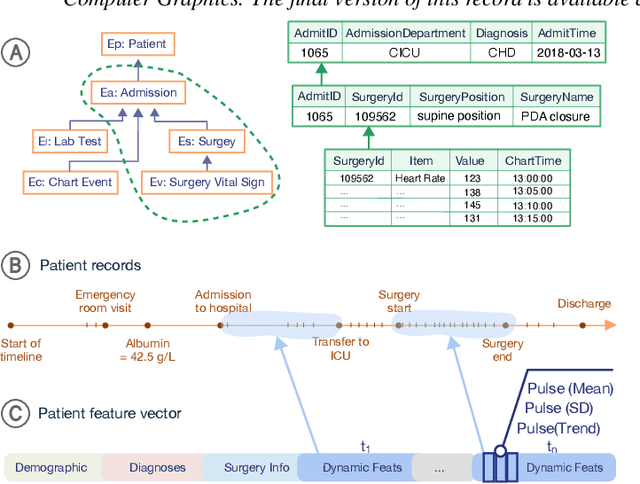
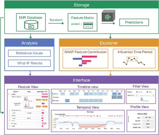
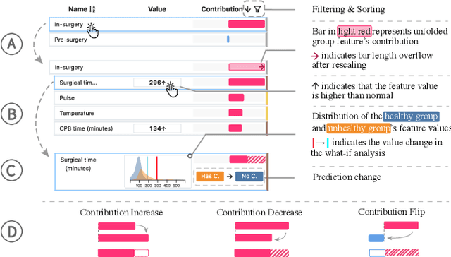
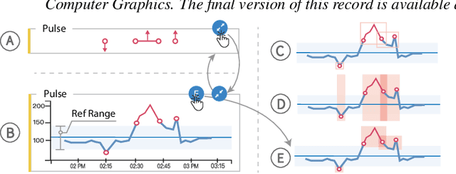
Machine learning (ML) is increasingly applied to Electronic Health Records (EHRs) to solve clinical prediction tasks. Although many ML models perform promisingly, issues with model transparency and interpretability limit their adoption in clinical practice. Directly using existing explainable ML techniques in clinical settings can be challenging. Through literature surveys and collaborations with six clinicians with an average of 17 years of clinical experience, we identified three key challenges, including clinicians' unfamiliarity with ML features, lack of contextual information, and the need for cohort-level evidence. Following an iterative design process, we further designed and developed VBridge, a visual analytics tool that seamlessly incorporates ML explanations into clinicians' decision-making workflow. The system includes a novel hierarchical display of contribution-based feature explanations and enriched interactions that connect the dots between ML features, explanations, and data. We demonstrated the effectiveness of VBridge through two case studies and expert interviews with four clinicians, showing that visually associating model explanations with patients' situational records can help clinicians better interpret and use model predictions when making clinician decisions. We further derived a list of design implications for developing future explainable ML tools to support clinical decision-making.
M2Lens: Visualizing and Explaining Multimodal Models for Sentiment Analysis
Aug 01, 2021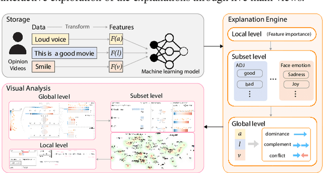
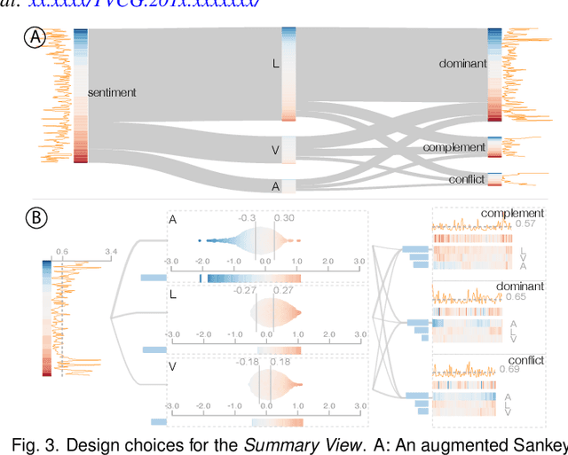
Multimodal sentiment analysis aims to recognize people's attitudes from multiple communication channels such as verbal content (i.e., text), voice, and facial expressions. It has become a vibrant and important research topic in natural language processing. Much research focuses on modeling the complex intra- and inter-modal interactions between different communication channels. However, current multimodal models with strong performance are often deep-learning-based techniques and work like black boxes. It is not clear how models utilize multimodal information for sentiment predictions. Despite recent advances in techniques for enhancing the explainability of machine learning models, they often target unimodal scenarios (e.g., images, sentences), and little research has been done on explaining multimodal models. In this paper, we present an interactive visual analytics system, M2Lens, to visualize and explain multimodal models for sentiment analysis. M2Lens provides explanations on intra- and inter-modal interactions at the global, subset, and local levels. Specifically, it summarizes the influence of three typical interaction types (i.e., dominance, complement, and conflict) on the model predictions. Moreover, M2Lens identifies frequent and influential multimodal features and supports the multi-faceted exploration of model behaviors from language, acoustic, and visual modalities. Through two case studies and expert interviews, we demonstrate our system can help users gain deep insights into the multimodal models for sentiment analysis.
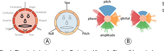
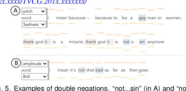
DeHumor: Visual Analytics for Decomposing Humor
Jul 18, 2021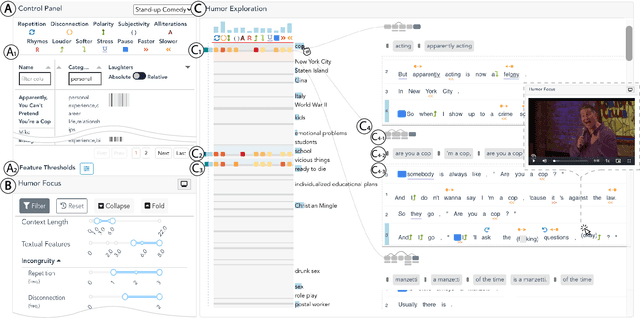
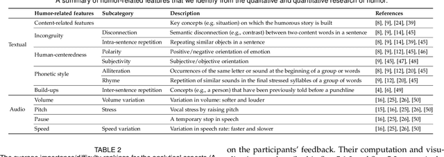
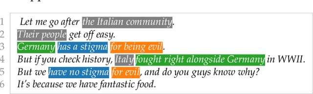
Despite being a critical communication skill, grasping humor is challenging -- a successful use of humor requires a mixture of both engaging content build-up and an appropriate vocal delivery (e.g., pause). Prior studies on computational humor emphasize the textual and audio features immediately next to the punchline, yet overlooking longer-term context setup. Moreover, the theories are usually too abstract for understanding each concrete humor snippet. To fill in the gap, we develop DeHumor, a visual analytical system for analyzing humorous behaviors in public speaking. To intuitively reveal the building blocks of each concrete example, DeHumor decomposes each humorous video into multimodal features and provides inline annotations of them on the video script. In particular, to better capture the build-ups, we introduce content repetition as a complement to features introduced in theories of computational humor and visualize them in a context linking graph. To help users locate the punchlines that have the desired features to learn, we summarize the content (with keywords) and humor feature statistics on an augmented time matrix. With case studies on stand-up comedy shows and TED talks, we show that DeHumor is able to highlight various building blocks of humor examples. In addition, expert interviews with communication coaches and humor researchers demonstrate the effectiveness of DeHumor for multimodal humor analysis of speech content and vocal delivery.
GNNVis: A Visual Analytics Approach for Prediction Error Diagnosis of Graph Neural Networks
Dec 03, 2020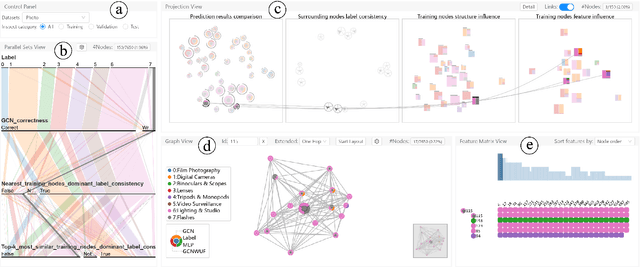
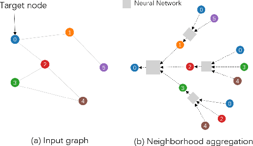
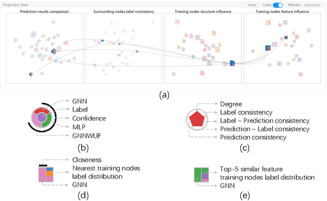
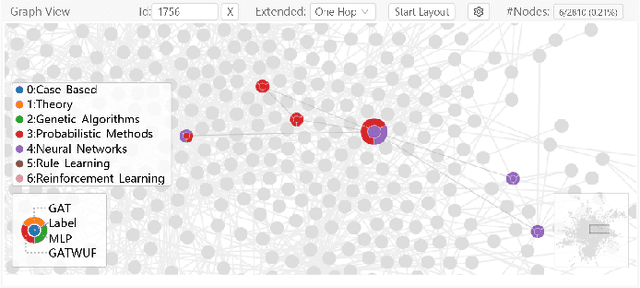
Graph Neural Networks (GNNs) aim to extend deep learning techniques to graph data and have achieved significant progress in graph analysis tasks (e.g., node classification) in recent years. However, similar to other deep neural networks like Convolutional Neural Networks (CNNs) and Recurrent Neural Networks (RNNs), GNNs behave like a black box with their details hidden from model developers and users. It is therefore difficult to diagnose possible errors of GNNs. Despite many visual analytics studies being done on CNNs and RNNs, little research has addressed the challenges for GNNs. This paper fills the research gap with an interactive visual analysis tool, GNNVis, to assist model developers and users in understanding and analyzing GNNs. Specifically, Parallel Sets View and Projection View enable users to quickly identify and validate error patterns in the set of wrong predictions; Graph View and Feature Matrix View offer a detailed analysis of individual nodes to assist users in forming hypotheses about the error patterns. Since GNNs jointly model the graph structure and the node features, we reveal the relative influences of the two types of information by comparing the predictions of three models: GNN, Multi-Layer Perceptron (MLP), and GNN Without Using Features (GNNWUF). Two case studies and interviews with domain experts demonstrate the effectiveness of GNNVis in facilitating the understanding of GNN models and their errors.
DECE: Decision Explorer with Counterfactual Explanations for Machine Learning Models
Aug 19, 2020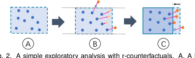
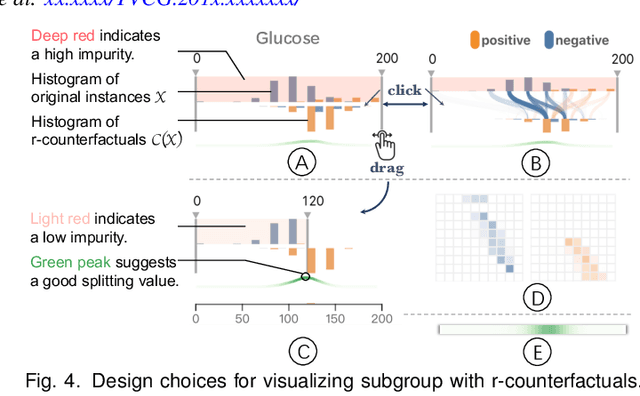
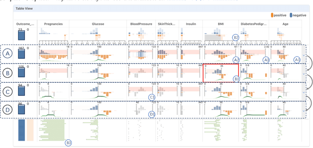
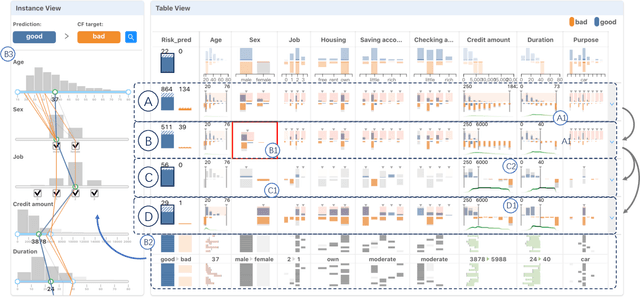
With machine learning models being increasingly applied to various decision-making scenarios, people have spent growing efforts to make machine learning models more transparent and explainable. Among various explanation techniques, counterfactual explanations have the advantages of being human-friendly and actionable -- a counterfactual explanation tells the user how to gain the desired prediction with minimal changes to the input. Besides, counterfactual explanations can also serve as efficient probes to the models' decisions. In this work, we exploit the potential of counterfactual explanations to understand and explore the behavior of machine learning models. We design DECE, an interactive visualization system that helps understand and explore a model's decisions on individual instances and data subsets, supporting users ranging from decision-subjects to model developers. DECE supports exploratory analysis of model decisions by combining the strengths of counterfactual explanations at instance- and subgroup-levels. We also introduce a set of interactions that enable users to customize the generation of counterfactual explanations to find more actionable ones that can suit their needs. Through three use cases and an expert interview, we demonstrate the effectiveness of DECE in supporting decision exploration tasks and instance explanations.