 Add to Chrome
 Add to Firefox
 Add to Edge
Intentmaking and Sensemaking: Human Interaction with AI-Guided Mathematical Discovery
May 07, 2026Artificial intelligence offers powerful new tools for scientific discovery, but the interaction paradigms required to effectively harness these systems remain underexplored. In this paper, we present findings from a formative user study with 11 expert mathematicians who used AlphaEvolve, an evolutionary coding agent, to tackle advanced problems in their fields of expertise. We identify and characterize a distinct workflow we term intentmaking, the iterative process of discovering, defining, and refining one's experimental goals through active system interaction. We frame this as a natural extension to sensemaking, the cognitive process of building an understanding of complex or novel data. We suggest that users enter a cycle of intentmaking (defining and updating their experiment) and sensemaking (interpreting the results) which repeats many times during the course of an investigation. Our documentation of these themes suggests an approach to designing AI tools for scientific discovery that goes beyond the existing question/answer model of many current systems, treating them as collaborative instruments rather than opaque black-box assistants.
Evaluating Text-to-Image Synthesis: Survey and Taxonomy of Image Quality Metrics
Mar 29, 2024Recent advances in text-to-image synthesis enabled through a combination of language and vision foundation models have led to a proliferation of the tools available and an increased attention to the field. When conducting text-to-image synthesis, a central goal is to ensure that the content between text and image is aligned. As such, there exist numerous evaluation metrics that aim to mimic human judgement. However, it is often unclear which metric to use for evaluating text-to-image synthesis systems as their evaluation is highly nuanced. In this work, we provide a comprehensive overview of existing text-to-image evaluation metrics. Based on our findings, we propose a new taxonomy for categorizing these metrics. Our taxonomy is grounded in the assumption that there are two main quality criteria, namely compositionality and generality, which ideally map to human preferences. Ultimately, we derive guidelines for practitioners conducting text-to-image evaluation, discuss open challenges of evaluation mechanisms, and surface limitations of current metrics.
An In-depth Look at Gemini's Language Abilities
Dec 24, 2023The recently released Google Gemini class of models are the first to comprehensively report results that rival the OpenAI GPT series across a wide variety of tasks. In this paper, we do an in-depth exploration of Gemini's language abilities, making two contributions. First, we provide a third-party, objective comparison of the abilities of the OpenAI GPT and Google Gemini models with reproducible code and fully transparent results. Second, we take a closer look at the results, identifying areas where one of the two model classes excels. We perform this analysis over 10 datasets testing a variety of language abilities, including reasoning, answering knowledge-based questions, solving math problems, translating between languages, generating code, and acting as instruction-following agents. From this analysis, we find that Gemini Pro achieves accuracy that is close but slightly inferior to the corresponding GPT 3.5 Turbo on all tasks that we benchmarked. We further provide explanations for some of this under-performance, including failures in mathematical reasoning with many digits, sensitivity to multiple-choice answer ordering, aggressive content filtering, and others. We also identify areas where Gemini demonstrates comparably high performance, including generation into non-English languages, and handling longer and more complex reasoning chains. Code and data for reproduction can be found at https://github.com/neulab/gemini-benchmark
Neural Activation Patterns (NAPs): Visual Explainability of Learned Concepts
Jun 20, 2022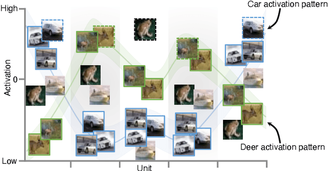
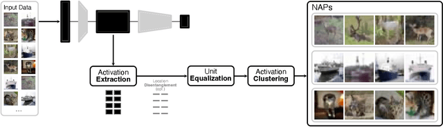
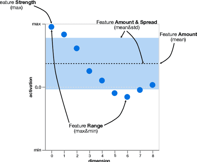
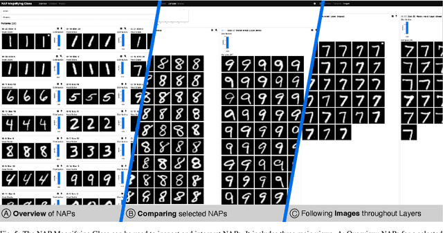
A key to deciphering the inner workings of neural networks is understanding what a model has learned. Promising methods for discovering learned features are based on analyzing activation values, whereby current techniques focus on analyzing high activation values to reveal interesting features on a neuron level. However, analyzing high activation values limits layer-level concept discovery. We present a method that instead takes into account the entire activation distribution. By extracting similar activation profiles within the high-dimensional activation space of a neural network layer, we find groups of inputs that are treated similarly. These input groups represent neural activation patterns (NAPs) and can be used to visualize and interpret learned layer concepts. We release a framework with which NAPs can be extracted from pre-trained models and provide a visual introspection tool that can be used to analyze NAPs. We tested our method with a variety of networks and show how it complements existing methods for analyzing neural network activation values.
Symphony: Composing Interactive Interfaces for Machine Learning
Feb 18, 2022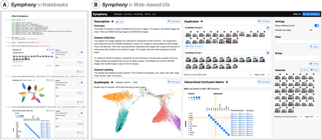
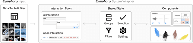
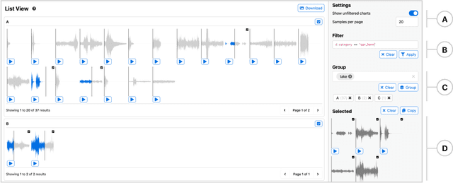
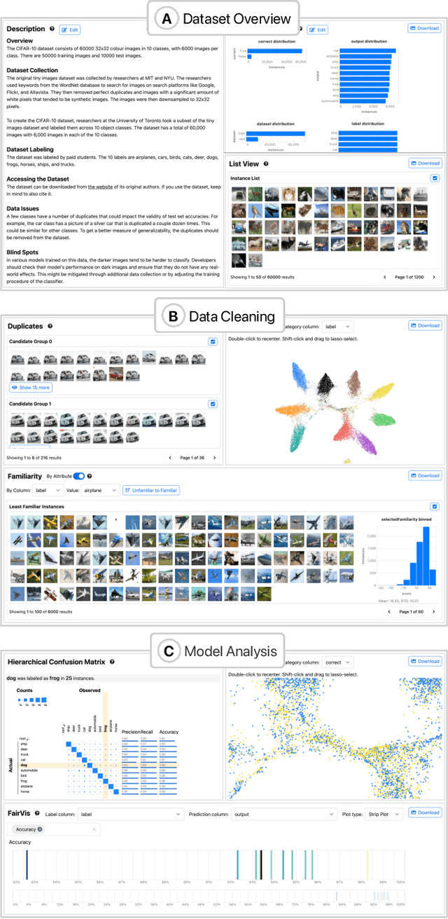
Interfaces for machine learning (ML), information and visualizations about models or data, can help practitioners build robust and responsible ML systems. Despite their benefits, recent studies of ML teams and our interviews with practitioners (n=9) showed that ML interfaces have limited adoption in practice. While existing ML interfaces are effective for specific tasks, they are not designed to be reused, explored, and shared by multiple stakeholders in cross-functional teams. To enable analysis and communication between different ML practitioners, we designed and implemented Symphony, a framework for composing interactive ML interfaces with task-specific, data-driven components that can be used across platforms such as computational notebooks and web dashboards. We developed Symphony through participatory design sessions with 10 teams (n=31), and discuss our findings from deploying Symphony to 3 production ML projects at Apple. Symphony helped ML practitioners discover previously unknown issues like data duplicates and blind spots in models while enabling them to share insights with other stakeholders.
Visual Identification of Problematic Bias in Large Label Spaces
Jan 17, 2022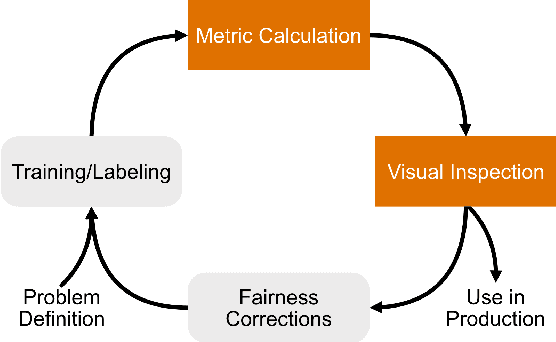

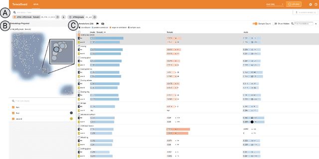
While the need for well-trained, fair ML systems is increasing ever more, measuring fairness for modern models and datasets is becoming increasingly difficult as they grow at an unprecedented pace. One key challenge in scaling common fairness metrics to such models and datasets is the requirement of exhaustive ground truth labeling, which cannot always be done. Indeed, this often rules out the application of traditional analysis metrics and systems. At the same time, ML-fairness assessments cannot be made algorithmically, as fairness is a highly subjective matter. Thus, domain experts need to be able to extract and reason about bias throughout models and datasets to make informed decisions. While visual analysis tools are of great help when investigating potential bias in DL models, none of the existing approaches have been designed for the specific tasks and challenges that arise in large label spaces. Addressing the lack of visualization work in this area, we propose guidelines for designing visualizations for such large label spaces, considering both technical and ethical issues. Our proposed visualization approach can be integrated into classical model and data pipelines, and we provide an implementation of our techniques open-sourced as a TensorBoard plug-in. With our approach, different models and datasets for large label spaces can be systematically and visually analyzed and compared to make informed fairness assessments tackling problematic bias.
Measuring Model Biases in the Absence of Ground Truth
Mar 05, 2021
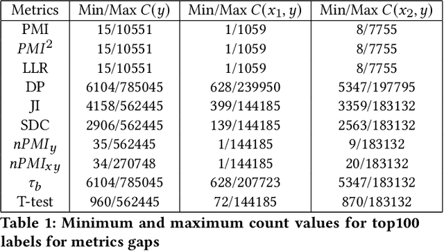
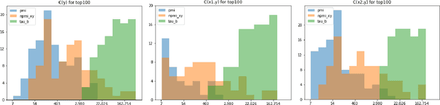
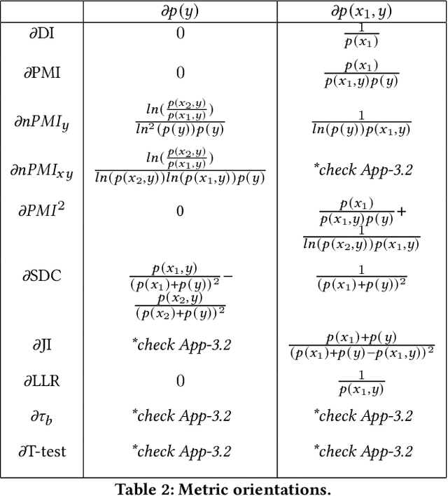
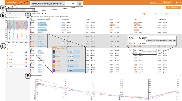
Recent advances in computer vision have led to the development of image classification models that can predict tens of thousands of object classes. Training these models can require millions of examples, leading to a demand of potentially billions of annotations. In practice, however, images are typically sparsely annotated, which can lead to problematic biases in the distribution of ground truth labels that are collected. This potential for annotation bias may then limit the utility of ground truth-dependent fairness metrics (e.g., Equalized Odds). To address this problem, in this work we introduce a new framing to the measurement of fairness and bias that does not rely on ground truth labels. Instead, we treat the model predictions for a given image as a set of labels, analogous to a 'bag of words' approach used in Natural Language Processing (NLP). This allows us to explore different association metrics between prediction sets in order to detect patterns of bias. We apply this approach to examine the relationship between identity labels, and all other labels in the dataset, using labels associated with 'male' and 'female') as a concrete example. We demonstrate how the statistical properties (especially normalization) of the different association metrics can lead to different sets of labels detected as having "gender bias". We conclude by demonstrating that pointwise mutual information normalized by joint probability (nPMI) is able to detect many labels with significant gender bias despite differences in the labels' marginal frequencies. Finally, we announce an open-sourced nPMI visualization tool using TensorBoard.
exploRNN: Understanding Recurrent Neural Networks through Visual Exploration
Dec 09, 2020
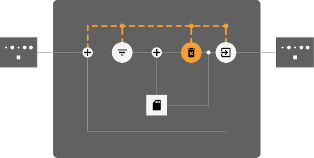
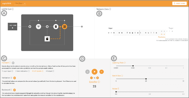
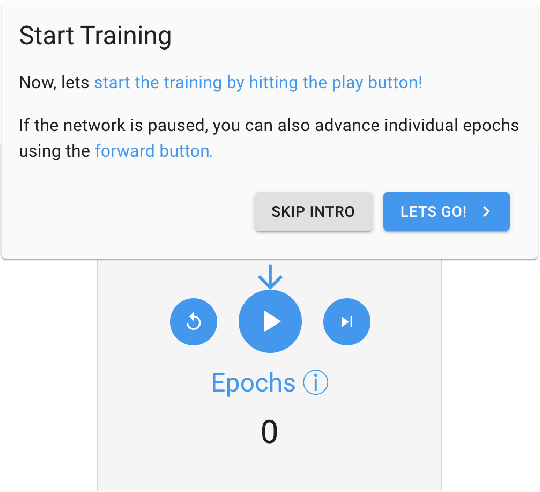
Due to the success of deep learning and its growing job market, students and researchers from many areas are getting interested in learning about deep learning technologies. Visualization has proven to be of great help during this learning process, while most current educational visualizations are targeted towards one specific architecture or use case. Unfortunately, recurrent neural networks (RNNs), which are capable of processing sequential data, are not covered yet, despite the fact that tasks on sequential data, such as text and function analysis, are at the forefront of deep learning research. Therefore, we propose exploRNN, the first interactively explorable, educational visualization for RNNs. exploRNN allows for interactive experimentation with RNNs, and provides in-depth information on their functionality and behavior during training. By defining educational objectives targeted towards understanding RNNs, and using these as guidelines throughout the visual design process, we have designed exploRNN to communicate the most important concepts of RNNs directly within a web browser. By means of exploRNN, we provide an overview of the training process of RNNs at a coarse level, while also allowing detailed inspection of the data-flow within LSTM cells. Within this paper, we motivate our design of exploRNN, detail its realization, and discuss the results of a user study investigating the benefits of exploRNN.
Net2Vis: Transforming Deep Convolutional Networks into Publication-Ready Visualizations
Mar 06, 2019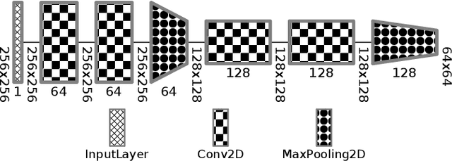


To properly convey neural network architectures in publications, appropriate visualization techniques are of great importance. While most current deep learning papers contain such visualizations, these are usually handcrafted, which results in a lack of a common visual grammar, as well as a significant time investment. Since these visualizations are often crafted just before publication, they are also prone to contain errors, might deviate from the actual architecture, and are sometimes ambiguous to interpret. Current automatic network visualization toolkits focus on debugging the network itself, and are therefore not ideal for generating publication-ready visualization, as they cater a different level of detail. Therefore, we present an approach to automate this process by translating network architectures specified in Python, into publication-ready network visualizations that can directly be embedded into any publication. To improve the readability of these visualizations, and in order to make them comparable, the generated visualizations obey to a visual grammar, which we have derived based on the analysis of existing network visualizations. Besides carefully crafted visual encodings, our grammar also incorporates abstraction through layer accumulation, as it is often done to reduce the complexity of the network architecture to be communicated. Thus, our approach not only reduces the time needed to generate publication-ready network visualizations, but also enables a unified and unambiguous visualization design.
Training De-Confusion: An Interactive, Network-Supported Visual Analysis System for Resolving Errors in Image Classification Training Data
Aug 09, 2018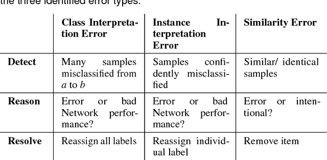
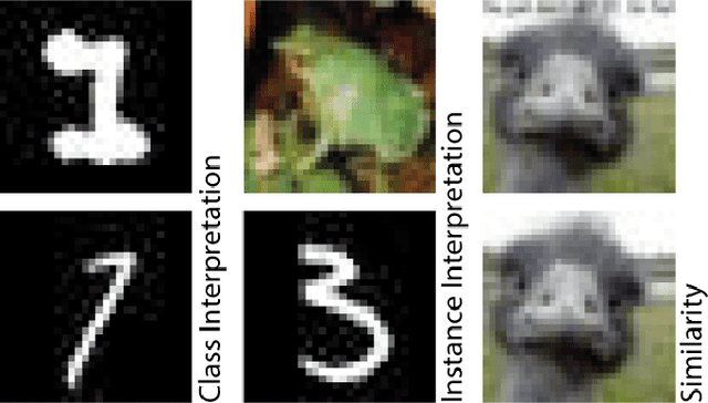
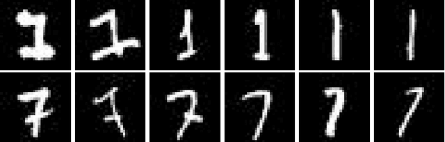
Convolutional neural networks gain more and more popularity in image classification tasks since they are often even able to outperform human classifiers. While much research has been targeted towards network architecture optimization, the optimization of the labeled training data has not been explicitly targeted yet. Since labeling of training data is time-consuming, it is often performed by less experienced domain experts or even outsourced to online services. Unfortunately, this results in labeling errors, which directly impact the classification performance of the trained network. To overcome this problem, we propose an interactive visual analysis system that helps to spot and correct errors in the training dataset. For this purpose, we have identified instance interpretation errors, class interpretation errors and similarity errors as frequently occurring errors, which shall be resolved to improve classification performance. After we detect these errors, users are guided towards them through a two-step visual analysis process, in which they can directly reassign labels to resolve the detected errors. Thus, with the proposed visual analysis system, the user has to inspect far fewer items to resolve labeling errors in the training dataset, and thus arrives at satisfying training results more quickly.