 Add to Chrome
 Add to Firefox
 Add to Edge
Understanding the Dataset Practitioners Behind Large Language Model Development
Feb 21, 2024

As large language models (LLMs) become more advanced and impactful, it is increasingly important to scrutinize the data that they rely upon and produce. What is it to be a dataset practitioner doing this work? We approach this in two parts: first, we define the role of "dataset practitioner" by performing a retrospective analysis on the responsibilities of teams contributing to LLM development at Google. Then, we conduct semi-structured interviews with a cross-section of these practitioners (N=10). We find that data quality is the top priority. To evaluate data quality, practitioners either rely on their own intuition or write custom evaluation logic. There is a lack of consensus across practitioners on what quality is and how to evaluate it. We discuss potential reasons for this phenomenon and opportunities for alignment.
LLM Comparator: Visual Analytics for Side-by-Side Evaluation of Large Language Models
Feb 16, 2024


Automatic side-by-side evaluation has emerged as a promising approach to evaluating the quality of responses from large language models (LLMs). However, analyzing the results from this evaluation approach raises scalability and interpretability challenges. In this paper, we present LLM Comparator, a novel visual analytics tool for interactively analyzing results from automatic side-by-side evaluation. The tool supports interactive workflows for users to understand when and why a model performs better or worse than a baseline model, and how the responses from two models are qualitatively different. We iteratively designed and developed the tool by closely working with researchers and engineers at a large technology company. This paper details the user challenges we identified, the design and development of the tool, and an observational study with participants who regularly evaluate their models.
VLSlice: Interactive Vision-and-Language Slice Discovery
Sep 13, 2023


Recent work in vision-and-language demonstrates that large-scale pretraining can learn generalizable models that are efficiently transferable to downstream tasks. While this may improve dataset-scale aggregate metrics, analyzing performance around hand-crafted subgroups targeting specific bias dimensions reveals systemic undesirable behaviors. However, this subgroup analysis is frequently stalled by annotation efforts, which require extensive time and resources to collect the necessary data. Prior art attempts to automatically discover subgroups to circumvent these constraints but typically leverages model behavior on existing task-specific annotations and rapidly degrades on more complex inputs beyond "tabular" data, none of which study vision-and-language models. This paper presents VLSlice, an interactive system enabling user-guided discovery of coherent representation-level subgroups with consistent visiolinguistic behavior, denoted as vision-and-language slices, from unlabeled image sets. We show that VLSlice enables users to quickly generate diverse high-coherency slices in a user study (n=22) and release the tool publicly.
Visualizing Linguistic Diversity of Text Datasets Synthesized by Large Language Models
May 19, 2023Large language models (LLMs) can be used to generate smaller, more refined datasets via few-shot prompting for benchmarking, fine-tuning or other use cases. However, understanding and evaluating these datasets is difficult, and the failure modes of LLM-generated data are still not well understood. Specifically, the data can be repetitive in surprising ways, not only semantically but also syntactically and lexically. We present LinguisticLens, a novel inter-active visualization tool for making sense of and analyzing syntactic diversity of LLM-generated datasets. LinguisticLens clusters text along syntactic, lexical, and semantic axes. It supports hierarchical visualization of a text dataset, allowing users to quickly scan for an overview and inspect individual examples. The live demo is available at shorturl.at/zHOUV.
Beyond Value: CHECKLIST for Testing Inferences in Planning-Based RL
Jun 07, 2022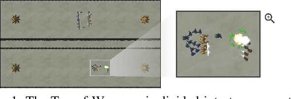
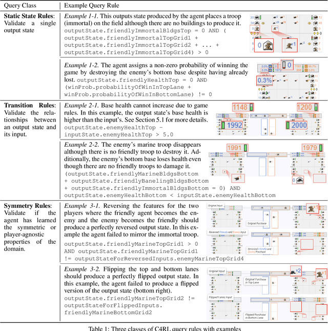
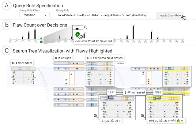
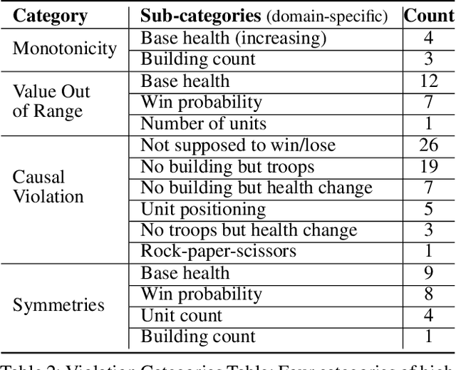
Reinforcement learning (RL) agents are commonly evaluated via their expected value over a distribution of test scenarios. Unfortunately, this evaluation approach provides limited evidence for post-deployment generalization beyond the test distribution. In this paper, we address this limitation by extending the recent CheckList testing methodology from natural language processing to planning-based RL. Specifically, we consider testing RL agents that make decisions via online tree search using a learned transition model and value function. The key idea is to improve the assessment of future performance via a CheckList approach for exploring and assessing the agent's inferences during tree search. The approach provides the user with an interface and general query-rule mechanism for identifying potential inference flaws and validating expected inference invariances. We present a user study involving knowledgeable AI researchers using the approach to evaluate an agent trained to play a complex real-time strategy game. The results show the approach is effective in allowing users to identify previously-unknown flaws in the agent's reasoning. In addition, our analysis provides insight into how AI experts use this type of testing approach, which may help improve future instantiations.
Visual Exploration of Large-Scale Image Datasets for Machine Learning with Treemaps
May 14, 2022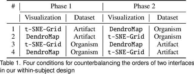
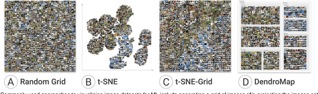
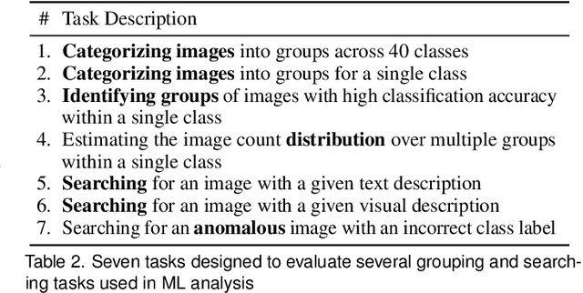
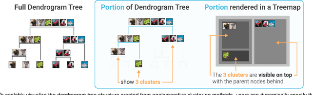
In this paper, we present DendroMap, a novel approach to interactively exploring large-scale image datasets for machine learning. Machine learning practitioners often explore image datasets by generating a grid of images or projecting high-dimensional representations of images into 2-D using dimensionality reduction techniques (e.g., t-SNE). However, neither approach effectively scales to large datasets because images are ineffectively organized and interactions are insufficiently supported. To address these challenges, we develop DendroMap by adapting Treemaps, a well-known visualization technique. DendroMap effectively organizes images by extracting hierarchical cluster structures from high-dimensional representations of images. It enables users to make sense of the overall distributions of datasets and interactively zoom into specific areas of interests at multiple levels of abstraction. Our case studies with widely-used image datasets for deep learning demonstrate that users can discover insights about datasets and trained models by examining the diversity of images, identifying underperforming subgroups, and analyzing classification errors. We conducted a user study that evaluates the effectiveness of DendroMap in grouping and searching tasks by comparing it with a gridified version of t-SNE and found that participants preferred DendroMap over the compared method.
Identifying Reasoning Flaws in Planning-Based RL Using Tree Explanations
Sep 28, 2021
Enabling humans to identify potential flaws in an agent's decision making is an important Explainable AI application. We consider identifying such flaws in a planning-based deep reinforcement learning (RL) agent for a complex real-time strategy game. In particular, the agent makes decisions via tree search using a learned model and evaluation function over interpretable states and actions. This gives the potential for humans to identify flaws at the level of reasoning steps in the tree, even if the entire reasoning process is too complex to understand. However, it is unclear whether humans will be able to identify such flaws due to the size and complexity of trees. We describe a user interface and case study, where a small group of AI experts and developers attempt to identify reasoning flaws due to inaccurate agent learning. Overall, the interface allowed the group to identify a number of significant flaws of varying types, demonstrating the promise of this approach.
From Heatmaps to Structural Explanations of Image Classifiers
Sep 13, 2021
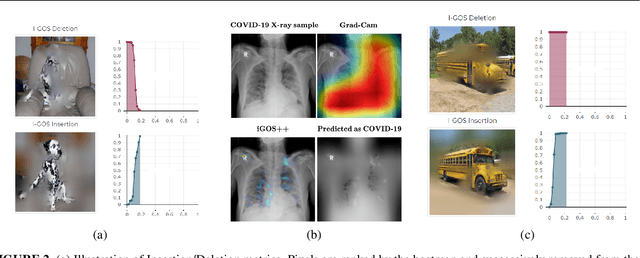
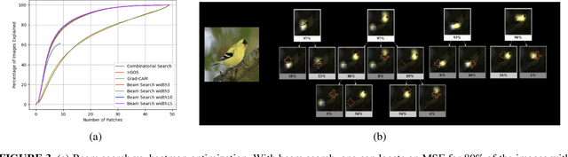
This paper summarizes our endeavors in the past few years in terms of explaining image classifiers, with the aim of including negative results and insights we have gained. The paper starts with describing the explainable neural network (XNN), which attempts to extract and visualize several high-level concepts purely from the deep network, without relying on human linguistic concepts. This helps users understand network classifications that are less intuitive and substantially improves user performance on a difficult fine-grained classification task of discriminating among different species of seagulls. Realizing that an important missing piece is a reliable heatmap visualization tool, we have developed I-GOS and iGOS++ utilizing integrated gradients to avoid local optima in heatmap generation, which improved the performance across all resolutions. During the development of those visualizations, we realized that for a significant number of images, the classifier has multiple different paths to reach a confident prediction. This has lead to our recent development of structured attention graphs (SAGs), an approach that utilizes beam search to locate multiple coarse heatmaps for a single image, and compactly visualizes a set of heatmaps by capturing how different combinations of image regions impact the confidence of a classifier. Through the research process, we have learned much about insights in building deep network explanations, the existence and frequency of multiple explanations, and various tricks of the trade that make explanations work. In this paper, we attempt to share those insights and opinions with the readers with the hope that some of them will be informative for future researchers on explainable deep learning.
Contrastive Identification of Covariate Shift in Image Data
Aug 19, 2021


Identifying covariate shift is crucial for making machine learning systems robust in the real world and for detecting training data biases that are not reflected in test data. However, detecting covariate shift is challenging, especially when the data consists of high-dimensional images, and when multiple types of localized covariate shift affect different subspaces of the data. Although automated techniques can be used to detect the existence of covariate shift, our goal is to help human users characterize the extent of covariate shift in large image datasets with interfaces that seamlessly integrate information obtained from the detection algorithms. In this paper, we design and evaluate a new visual interface that facilitates the comparison of the local distributions of training and test data. We conduct a quantitative user study on multi-attribute facial data to compare two different learned low-dimensional latent representations (pretrained ImageNet CNN vs. density ratio) and two user analytic workflows (nearest-neighbor vs. cluster-to-cluster). Our results indicate that the latent representation of our density ratio model, combined with a nearest-neighbor comparison, is the most effective at helping humans identify covariate shift.
Structured Attention Graphs for Understanding Deep Image Classifications
Dec 08, 2020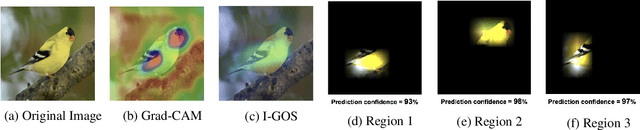
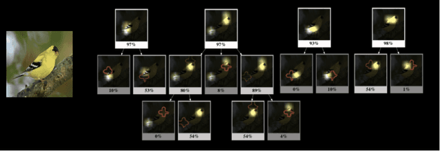
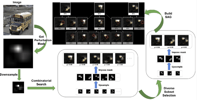
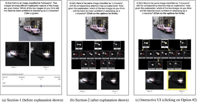
Attention maps are a popular way of explaining the decisions of convolutional networks for image classification. Typically, for each image of interest, a single attention map is produced, which assigns weights to pixels based on their importance to the classification. A single attention map, however, provides an incomplete understanding since there are often many other maps that explain a classification equally well. In this paper, we introduce structured attention graphs (SAGs), which compactly represent sets of attention maps for an image by capturing how different combinations of image regions impact a classifier's confidence. We propose an approach to compute SAGs and a visualization for SAGs so that deeper insight can be gained into a classifier's decisions. We conduct a user study comparing the use of SAGs to traditional attention maps for answering counterfactual questions about image classifications. Our results show that the users are more correct when answering comparative counterfactual questions based on SAGs compared to the baselines.