 Add to Chrome
 Add to Firefox
 Add to Edge
Knee Point Identification Based on Trade-Off Utility
May 23, 2020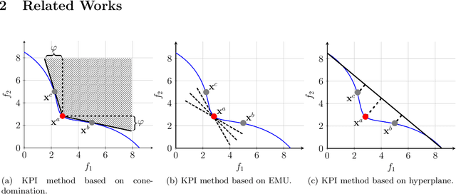
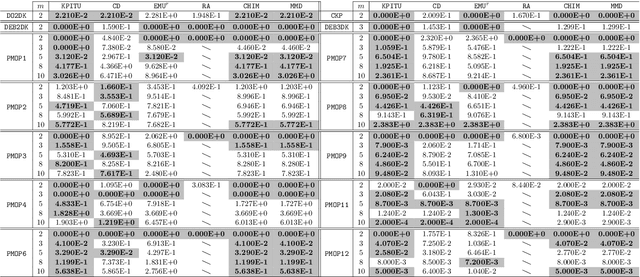
Knee points, characterised as their smallest trade-off loss at all objectives, are attractive to decision makers in multi-criterion decision-making. In contrast, other Pareto-optimal solutions are less attractive since a small improvement on one objective can lead to a significant degradation on at least one of the other objectives. In this paper, we propose a simple and effective knee point identification method based on trade-off utility, dubbed KPITU, to help decision makers identify knee points from a given set of trade-off solutions. The basic idea of KPITU is to sequentially validate whether a solution is a knee point or not by comparing its trade-off utility with others within its neighbourhood. In particular, a solution is a knee point if and only if it has the best trade-off utility among its neighbours. Moreover, we implement a GPU version of KPITU that carries out the knee point identification in a parallel manner. This GPU version reduces the worst-case complexity from quadratic to linear. To validate the effectiveness of KPITU, we compare its performance with five state-of-the-art knee point identification methods on 134 test problem instances. Empirical results fully demonstrate the outstanding performance of KPITU especially on problems with many local knee points. At the end, we further validate the usefulness of KPITU for guiding EMO algorithms to search for knee points on the fly during the evolutionary process.
Visualisation of Pareto Front Approximation: A Short Survey and Empirical Comparisons
Mar 05, 2019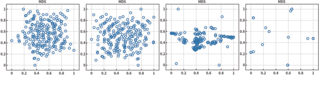
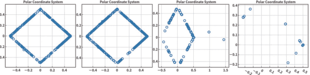
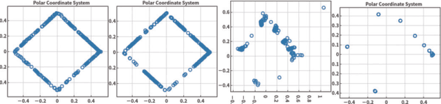
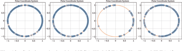
Visualisation is an effective way to facilitate the analysis and understanding of multivariate data. In the context of multi-objective optimisation, comparing to quantitative performance metrics, visualisation is, in principle, able to provide a decision maker better insights about Pareto front approximation sets (e.g. the distribution of solutions, the geometric characteristics of Pareto front approximation) thus to facilitate the decision-making (e.g. the exploration of trade-off relationship, the knee region or region of interest). In this paper, we overview some currently prevalent visualisation techniques according to the way how data is represented. To have a better understanding of the pros and cons of different visualisation techniques, we empirically compare six representative visualisation techniques for the exploratory analysis of different Pareto front approximation sets obtained by four state-of-the-art evolutionary multi-objective optimisation algorithms on the classic DTLZ benchmark test problems. From the empirical results, we find that visual comparisons also follow the \textit{No-Free-Lunch} theorem where no single visualisation technique is able to provide a comprehensive understanding of the characteristics of a Pareto front approximation set. In other words, a specific type of visualisation technique is only good at exploring a particular aspect of the data.