 Add to Chrome
 Add to Firefox
 Add to Edge
Automated Residual Plot Assessment With the R Package autovi and the Shiny Application autovi.web
Jun 23, 2026Visual assessment of residual plots is a common approach for diagnosing linear models, but it relies on manual evaluation, which does not scale well and can lead to inconsistent decisions across analysts. The lineup protocol, which embeds the observed plot among null plots, can reduce subjectivity but requires even more human effort. In today's data-driven world, such tasks are well suited for automation. We present a new R package that uses a computer vision model to automate the evaluation of residual plots. An accompanying Shiny application is provided for ease of use. Given a sample of residuals, the model predicts a visual signal strength (VSS) and offers supporting information to help analysts assess model fit.
* Published in Australian & New Zealand Journal of Statistics
An Enhanced Projection Pursuit Tree Classifier with Visual Methods for Assessing Algorithmic Improvements
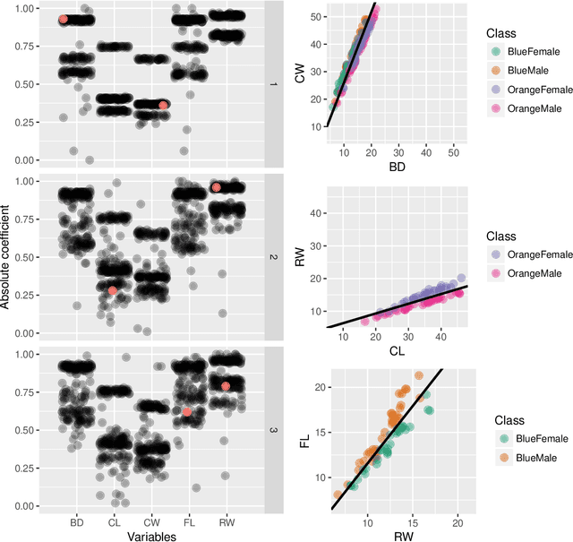
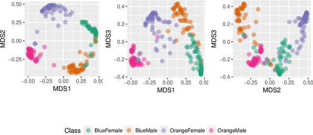
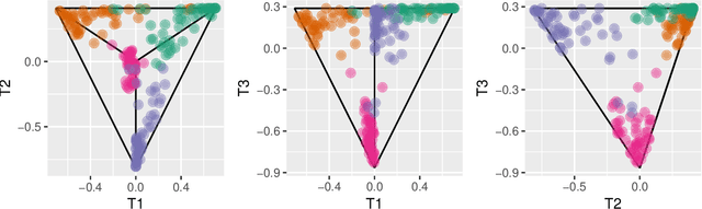
Feb 24, 2026This paper presents enhancements to the projection pursuit tree classifier and visual diagnostic methods for assessing their impact in high dimensions. The original algorithm uses linear combinations of variables in a tree structure where depth is constrained to be less than the number of classes -- a limitation that proves too rigid for complex classification problems. Our extensions improve performance in multi-class settings with unequal variance-covariance structures and nonlinear class separations by allowing more splits and more flexible class groupings in the projection pursuit computation. Proposing algorithmic improvements is straightforward; demonstrating their actual utility is not. We therefore develop two visual diagnostic approaches to verify that the enhancements perform as intended. Using high-dimensional visualization techniques, we examine model fits on benchmark datasets to assess whether the algorithm behaves as theorized. An interactive web application enables users to explore the behavior of both the original and enhanced classifiers under controlled scenarios. The enhancements are implemented in the R package PPtreeExt.
Automated Assessment of Residual Plots with Computer Vision Models
Nov 01, 2024


Plotting the residuals is a recommended procedure to diagnose deviations from linear model assumptions, such as non-linearity, heteroscedasticity, and non-normality. The presence of structure in residual plots can be tested using the lineup protocol to do visual inference. There are a variety of conventional residual tests, but the lineup protocol, used as a statistical test, performs better for diagnostic purposes because it is less sensitive and applies more broadly to different types of departures. However, the lineup protocol relies on human judgment which limits its scalability. This work presents a solution by providing a computer vision model to automate the assessment of residual plots. It is trained to predict a distance measure that quantifies the disparity between the residual distribution of a fitted classical normal linear regression model and the reference distribution, based on Kullback-Leibler divergence. From extensive simulation studies, the computer vision model exhibits lower sensitivity than conventional tests but higher sensitivity than human visual tests. It is slightly less effective on non-linearity patterns. Several examples from classical papers and contemporary data illustrate the new procedures, highlighting its usefulness in automating the diagnostic process and supplementing existing methods.
Studying the Performance of the Jellyfish Search Optimiser for the Application of Projection Pursuit
Jul 18, 2024


The projection pursuit (PP) guided tour interactively optimises a criteria function known as the PP index, to explore high-dimensional data by revealing interesting projections. The optimisation in PP can be non-trivial, involving non-smooth functions and optima with a small squint angle, detectable only from close proximity. To address these challenges, this study investigates the performance of a recently introduced swarm-based algorithm, Jellyfish Search Optimiser (JSO), for optimising PP indexes. The performance of JSO for visualising data is evaluated across various hyper-parameter settings and compared with existing optimisers. Additionally, this work proposes novel methods to quantify two properties of the PP index, smoothness and squintability that capture the complexities inherent in PP optimisation problems. These two metrics are evaluated along with JSO hyper-parameters to determine their effects on JSO success rate. Our numerical results confirm the positive impact of these metrics on the JSO success rate, with squintability being the most significant. The JSO algorithm has been implemented in the tourr package and functions to calculate smoothness and squintability are available in the ferrn package.
A Clustering Algorithm to Organize Satellite Hotspot Data for the Purpose of Tracking Bushfires Remotely
Aug 21, 2023


This paper proposes a spatiotemporal clustering algorithm and its implementation in the R package spotoroo. This work is motivated by the catastrophic bushfires in Australia throughout the summer of 2019-2020 and made possible by the availability of satellite hotspot data. The algorithm is inspired by two existing spatiotemporal clustering algorithms but makes enhancements to cluster points spatially in conjunction with their movement across consecutive time periods. It also allows for the adjustment of key parameters, if required, for different locations and satellite data sources. Bushfire data from Victoria, Australia, is used to illustrate the algorithm and its use within the package.
Performance is not enough: a story of the Rashomon's quartet
Mar 17, 2023Predictive modelling is often reduced to finding the best model that optimizes a selected performance measure. But what if the second-best model describes the data equally well but in a completely different way? What about the third? Is it possible that the most effective models learn completely different relationships in the data? Inspired by Anscombe's quartet, this paper introduces Rashomon's quartet, a synthetic dataset for which four models from different classes have practically identical predictive performance. However, their visualization reveals drastically distinct ways of understanding the correlation structure in data. The introduced simple illustrative example aims to further facilitate visualization as a mandatory tool to compare predictive models beyond their performance. We need to develop insightful techniques for the explanatory analysis of model sets.
Exploring Local Explanations of Nonlinear Models Using Animated Linear Projections
May 11, 2022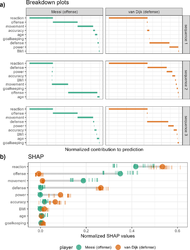
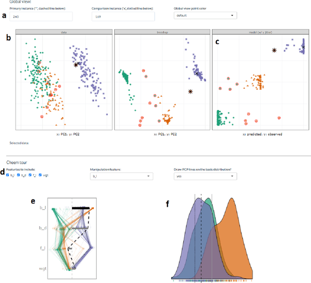
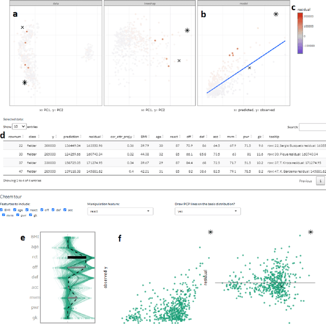
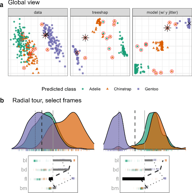
The increased predictive power of nonlinear models comes at the cost of interpretability of its terms. This trade-off has led to the emergence of eXplainable AI (XAI). XAI attempts to shed light on how models use predictors to arrive at a prediction with local explanations, a point estimate of the linear feature importance in the vicinity of one instance. These can be considered linear projections and can be further explored to understand better the interactions between features used to make predictions across the predictive model surface. Here we describe interactive linear interpolation used for exploration at any instance and illustrate with examples with categorical (penguin species, chocolate types) and quantitative (soccer/football salaries, house prices) output. The methods are implemented in the R package cheem, available on CRAN.
A Projection Pursuit Forest Algorithm for Supervised Classification
Jul 25, 2018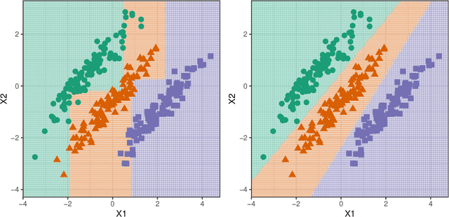
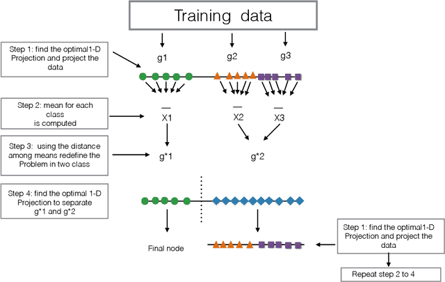
This paper presents a new ensemble learning method for classification problems called projection pursuit random forest (PPF). PPF uses the PPtree algorithm introduced in Lee et al. (2013). In PPF, trees are constructed by splitting on linear combinations of randomly chosen variables. Projection pursuit is used to choose a projection of the variables that best separates the classes. Utilizing linear combinations of variables to separate classes takes the correlation between variables into account which allows PPF to outperform a traditional random forest when separations between groups occurs in combinations of variables. The method presented here can be used in multi-class problems and is implemented into an R (R Core Team, 2018) package, PPforest, which is available on CRAN, with development versions at https://github.com/natydasilva/PPforest.
Interactive Graphics for Visually Diagnosing Forest Classifiers in R
Apr 08, 2017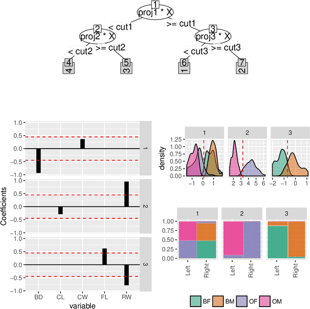
This paper describes structuring data and constructing plots to explore forest classification models interactively. A forest classifier is an example of an ensemble, produced by bagging multiple trees. The process of bagging and combining results from multiple trees, produces numerous diagnostics which, with interactive graphics, can provide a lot of insight into class structure in high dimensions. Various aspects are explored in this paper, to assess model complexity, individual model contributions, variable importance and dimension reduction, and uncertainty in prediction associated with individual observations. The ideas are applied to the random forest algorithm, and to the projection pursuit forest, but could be more broadly applied to other bagged ensembles. Interactive graphics are built in R, using the ggplot2, plotly, and shiny packages.