 Add to Chrome
 Add to Firefox
 Add to Edge
When One Point Is Not Enough: Addressing Ambiguous Instances in Dimensionality Reduction by Splitting
May 22, 2026
Dimensionality Reduction (DR) methods are widely used to visualize high-dimensional data. One key task in DR-based analysis is discovering neighborhoods, which relies on analyzing the fine-grained local structure of a projection. However, DR is an inherently lossy process; no technique can perfectly preserve the high-dimensional relationships, and projections therefore contain visual artifacts. In this paper, we highlight a typically overlooked source of visual artifacts: ambiguous instances. These are instances that are highly similar to multiple mutually dissimilar neighborhoods in the high-dimensional space. Standard DR methods cannot faithfully project such instances, since each data instance is mapped to a single point in the visual space. As a result, such an instance is placed in only one of its neighborhoods (or in none at all), so only part of its neighborhood structure is represented. We call this distortion partial neighborhood embedding. In this paper, we introduce a graph-based approach that identifies ambiguous instances and replicates them as multiple points in the projection, placing each copy within its respective neighborhood. We use UMAP for our results, but our approach also generalizes to other local graph-based DR techniques, and we show that our approach reveals previously hidden neighborhood memberships in projections and reduces partial neighborhood embedding across multiple examples, and is further supported by quantitative analyses.

Mind the Gaps: Measuring Visual Artifacts in Dimensionality Reduction
Nov 18, 2025Dimensionality Reduction (DR) techniques are commonly used for the visual exploration and analysis of high-dimensional data due to their ability to project datasets of high-dimensional points onto the 2D plane. However, projecting datasets in lower dimensions often entails some distortion, which is not necessarily easy to recognize but can lead users to misleading conclusions. Several Projection Quality Metrics (PQMs) have been developed as tools to quantify the goodness-of-fit of a DR projection; however, they mostly focus on measuring how well the projection captures the global or local structure of the data, without taking into account the visual distortion of the resulting plots, thus often ignoring the presence of outliers or artifacts that can mislead a visual analysis of the projection. In this work, we introduce the Warping Index (WI), a new metric for measuring the quality of DR projections onto the 2D plane, based on the assumption that the correct preservation of empty regions between points is of crucial importance towards a faithful visual representation of the data.
Why Can't I See My Clusters? A Precision-Recall Approach to Dimensionality Reduction Validation
Sep 04, 2025
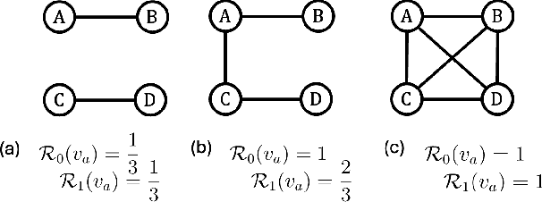
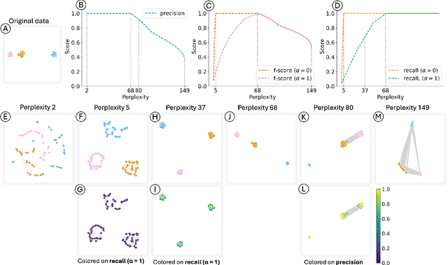
Dimensionality Reduction (DR) is widely used for visualizing high-dimensional data, often with the goal of revealing expected cluster structure. However, such a structure may not always appear in the projections. Existing DR quality metrics assess projection reliability (to some extent) or cluster structure quality, but do not explain why expected structures are missing. Visual Analytics solutions can help, but are often time-consuming due to the large hyperparameter space. This paper addresses this problem by leveraging a recent framework that divides the DR process into two phases: a relationship phase, where similarity relationships are modeled, and a mapping phase, where the data is projected accordingly. We introduce two supervised metrics, precision and recall, to evaluate the relationship phase. These metrics quantify how well the modeled relationships align with an expected cluster structure based on some set of labels representing this structure. We illustrate their application using t-SNE and UMAP, and validate the approach through various usage scenarios. Our approach can guide hyperparameter tuning, uncover projection artifacts, and determine if the expected structure is captured in the relationships, making the DR process faster and more reliable.
When Dimensionality Reduction Meets Graph (Drawing) Theory: Introducing a Common Framework, Challenges and Opportunities
Dec 09, 2024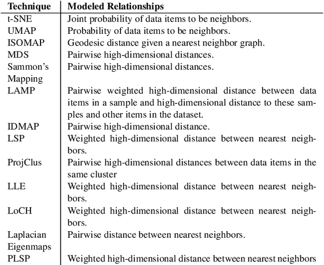
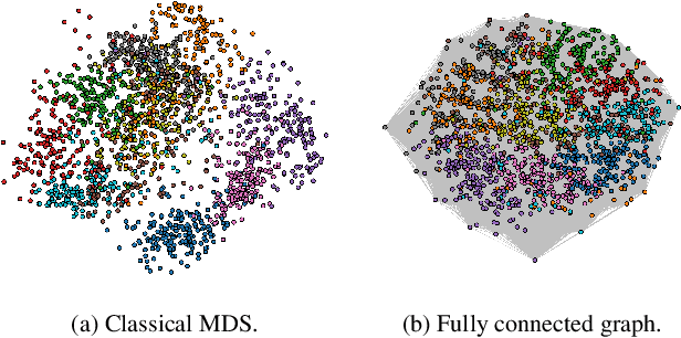
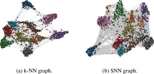
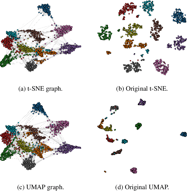
In the vast landscape of visualization research, Dimensionality Reduction (DR) and graph analysis are two popular subfields, often essential to most visual data analytics setups. DR aims to create representations to support neighborhood and similarity analysis on complex, large datasets. Graph analysis focuses on identifying the salient topological properties and key actors within networked data, with specialized research on investigating how such features could be presented to the user to ease the comprehension of the underlying structure. Although these two disciplines are typically regarded as disjoint subfields, we argue that both fields share strong similarities and synergies that can potentially benefit both. Therefore, this paper discusses and introduces a unifying framework to help bridge the gap between DR and graph (drawing) theory. Our goal is to use the strongly math-grounded graph theory to improve the overall process of creating DR visual representations. We propose how to break the DR process into well-defined stages, discussing how to match some of the DR state-of-the-art techniques to this framework and presenting ideas on how graph drawing, topology features, and some popular algorithms and strategies used in graph analysis can be employed to improve DR topology extraction, embedding generation, and result validation. We also discuss the challenges and identify opportunities for implementing and using our framework, opening directions for future visualization research.